Thursday 19 April 2012

I MASTERED PHOTOSHOP!!!!

Haha... Wish I can say I mastered Photoshop... But the truth is far, far away.
However, it has been an awesome journey and a great sense of satisfaction doing something new this semester.

Arigatou!

Kamsahamnida!

Gracias!

Terima Kasih!

Danke!

Nandri!

Xie Xie Ni!

Thank You...

...for tuning in to this blog :)


Wednesday 11 April 2012

My Final Three...

Artwork Title: In the iPad
Art Movement: Cubism
Reference Artist: Pablo Picasso
Theme Chose: Technology and Society
Ideation and Concept: 
Everywhere in our fast-paced tech-savvy society, we see people burying their heads in their gadgets. And this culture is also seen in the family context. The artwork portrays a family where each individual holds on to an iPad, depicting how the society that we are living in is having lesser interaction among individuals, but more focus on gadgets even though they are in the same environment (inside an Ipad). 

Artwork Title: Overtime
Art Movement: Cubism
Reference Artist: Pablo Picasso
Theme Chose: Technology and Society
Ideation and Concept: 
Absentee parent is seen as a cause of many social issues in the society. Technology has caused working parents to work more each day, leaving office late in the night, and having no time to spend with their children.

Artwork Title: Cluttered
Art Movement: Cubism
Reference Artist: Pablo Picasso
Theme Chose: Technology and Society
Ideation and Concept: 
Everyone is on their mobile phones which portray the busyness of the society today. Wherever there is network connection, people are seen to be cluttered around it.


Colors - The fun has just started!

Colors are added into the artwork by using Paint bucket tool [G]. The basic colors are added to the artwork first.

Shadings are then added on by drawing the path using the Pen tool [P]. But this time round, the Fill path option is chosen.

Further details are then added to the artwork. For instance, apple logo, together with common icons found on iPad are traced out using the Pen tool [P] from images found on the internet.
After the colors are added in to the artwork, the outline layer is moved to be the top layer to give a finishing touch to the artwork.

All three of my artworks used similar steps, and here are my final outputs:
In the iPad
Overtime
Cluttered

Genesis of Photoshop...

Every artwork started with a blank canvas... Similarly, Photoshop starts by creating a new canvas at the desired size. For this course, a 16 inches x 20 inches with 300 pixels/inched white canvas is selected.

* File > New

*Insert details of the new file

After that, I opened my scanned artwork, and resize it on my empty canvas.

*File > Open

*Select the area wanted, using the Rectangular Marquee Tool [M]
*Copy [Ctrl + C]
*Paste [Ctrl + V] it in the new file created earlier. 
*Using the Transform function [Ctrl + T], resize the drawing to fill the canvas.

*Hold down the [Shift] key to avoid the image from being distorted.

I decided to start by tracing the outlines of my scanned sketches using the brush tool. This is done for all three of my sketches.

* Use Brush tool [B] to draw the outlines. Straight lines are drawn by holding down the [Shift] key before selecting the second point.
(Orange lines are used for clearer illustration)

*Curve lines are drawn using the Pen tool [P]. A straight line is drawn before adding points to form the path wanted.

 *Stroke path is selected to apply Brush function on the path.

Here are my completed outlines for all three of my artworks:
In the iPad
Overtime
Cluttered

The New THREE :)

After presenting the sketches, I decided to listen to Mr Deepak's comment and change two of my final top three artworks. I have chosen to maintain 'Cluttered' and the other two artworks that made to my top three are 'In the Ipad' and 'Overtime'. Both of them are added into the Top Three List as they carry higher commercial values and bring out the theme Technology and Society.

Here are my new Top Three:
In the iPad
Overtime
Cluttered
However, I decided to add on more details to the sketches. Here are the new elaborated artwork:
In the iPad
Overtime
Cluttered
In the iPad
More details are added to this art work to paint a clearer picture of a family. Instead of only three human figures, elderly, children and a baby are added in the second sketch. I have also added in a dog at the left side of the painting, and a lizard at the top right side to bring more of Pablo Picasso's Three Musicians into the drawings.

Overtime
Once again, more details are added into the sketch. I added in a clock to further emphasize the time. Also, more elements are added to the the bottom half of the drawing to paint an office environment.

Cluttered
This drawing remain as the original sketch.

Wednesday 29 February 2012

The Lucky Three :)

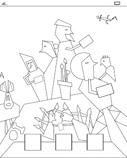
After looking at the presentations from my fellow classmates, I knew I need to bring out more of cubism into my sketches. So, I decided to look into more details of on my final 3 sketches. With the aim of adding more elements of cubism, I decided to play different tones, textures, and angles.

Here are the three sketches that I like most:

The Clash
Cluttered
No Peace


_________________________________________________________________________________


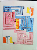
Sketch 1: The Clash.
The Clash in this drawing aims to answer the question "Technology: Does it builds or breaks relationship?". The maze in this drawing brings about the puzzle and battle between two groups of people; one focusing on technology, and the other purely on love with no technology. This drawing gives the viewer the liberty of deciding the outcome of the battle as the human figures in the picture does not carry any emotion in it. The clashing point is at the yellow and orange rectangle at the center of the drawing. Using back yellow and orange which is consistent with the two individuals at opposite ends of the drawing, the desired outcome of this battle will be to strike a balance, using the best of technology to build relationship in the society.


Elements of Design:
Line: Mostly straight lines, and a  few curve lines.
Shape: Angular shapes.
Color: Bright colors, with dark background.
Texture: A rough texture (crumpled paper texture) to be added into the painting using Adobe Photoshop for the maze. The drawing will be executed and printed on smooth surface.
Eye Movement: Viewer will follow the path of the maze.

Principle of Design:
Hierarchy: The focus of the drawing will be the maze, followed by the two human figures at diagonal end of the painting.
Balance, proportional.
Repetition of colors used - Orange and yellow.
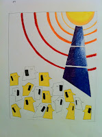
_________________________________________________________________________

Sketch 2: Cluttered
Cluttered aims to trigger the viewer to pause and look at the busyness of society today. Everywhere we go, we see people on mobile phones. From LRTs to the office, all the way to the dining table. The yellow semi-circle at the top right corner is drawn to look like the sun. However in this drawing, the high demand of the society for mobile coverage makes it as important as sunlight (which is a necessity in life). Mobile phones are no longer a luxury, but a necessity in the cluttered society that we are in.


Elements of Design:
Line: Mostly straight lines, and a curve lines for the network tower.
Shape: Angular shapes.
Color: Complimentary colors are used: orange and blue, and yellow and violet.
Texture: The drawing will be executed and printed on smooth surface.
Eye movement from the top right corner, to the bottom.

Principle of Design:
Hierarchy: The focus of the drawing will be the dark blue tower.
Proportional.
Repetition of human figures and semi-circles.
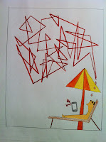
_________________________________________________________________________

Sketch 3: No Peace
No Peace brings out the irony of life. Even in the midst of a relaxing holiday, one can be troubled by the ringing mobile phone. With almost no boundaries to mobile coverage, there is no place one can hide to find peace from work. The zigzag inter-crossing red lines trigger emotions such as frustration and anger from being disturbed. However, the background chosen for this picture will be a view from the seaside, consisting of sandy beach and the clear sea water. The background aim to give a peaceful feeling to the picture, with effect similar to the stained glass windows found in traditional churches. 


Elements of Design:
Line: Mostly straight lines.
Shape: Angular shapes, mostly triangles.
Color: A mixture of warm (red, orange, yellow) and cool (blue, green) colors are used.
Texture: The drawing will be executed and printed on smooth surface.
Eye movement from the bottom right to the top left of the drawing.

Principle of Design:
Hierarchy: The focus of the drawing will be the person under the beach umbrella.
Not proportional, as the thoughts are bigger than the human figure.
Repetition of triangles in the background.